Bold, Modern & Ready for Summer – A Fresh Take on Amstel Radler
When Amstel first approached us to revitalise their Radler packs, the brief was clear: develop a bold, dramatic visual language that would stand apart from their traditional lager identity, while still maintaining a recognisable link to the iconic Amstel roundel. Crucially, the design needed to convey a feel-good, easy-drinking lifestyle appeal – a visual expression of what it means to enjoy a Radler on a warm, carefree day. With the fiercely competitive market, we knew that the new pack had to be both memorable and compelling at first glance.

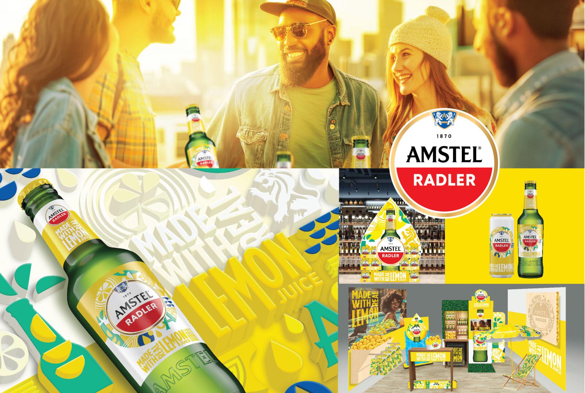
Breaking Away from Traditional Lemon Imagery
Early market analysis revealed that using overly literal lemon imagery could limit the emotional engagement Radler needed to attract new consumers. While Amstel is known for heritage and tradition, Radler demanded a fresh perspective – an aesthetic that truly captured the energy of summer and the zesty excitement of a lemon-infused beverage. Our goal was to evoke an authentic “lemon experience” without relying on clichés. To achieve this, we explored how deconstructed forms, vibrant colour palettes, and minimalist iconography could speak to the uplifting, sessionable quality of a Radler.

Reimagining the Brand Elements
Much of our creative process involved extracting and reworking Amstel’s core assets: the lion, crest, half-moon shape, and, of course, the roundel. We wanted these elements to remain recognisable but gain a modern, on-trend edge – one that would feel at home in the hands of a younger, lifestyle-focused audience. The half-moon, for example, was cleverly reinterpreted as a lemon wedge, while newly introduced juice droplet iconography emphasised the “made with real lemon” proposition. This thoughtful interplay of old and new gave the packs a distinct identity that is undeniably Amstel, yet undeniably different from the classic lager.

Why This Works
The strength of our final recommendations lies in the seamless way the redesigned elements transition across multiple touchpoints. Whether on single-serve bottles, multi-packs, or digital channels, the new design language remains fresh, cohesive, and instantly recognisable. By distilling the core brand assets and weaving in bright, evocative graphics and illustrations, we were able to create a vibrant Radler aesthetic while staying true to the classic Amstel cues. This flexible design system not only resonates with loyal fans of the brand but also opens the door to a broader audience seeking a light, fun, summery beverage.

We’re proud of how the final solution captures both the ease and energy of a lemon-infused drink, while paying homage to Amstel’s legacy in a striking new form. If you’re curious about how we can bring bold design thinking to your brand, get in touch – we’d love to help you stand out in a crowded market and capture the imagination of consumers everywhere.